"What makes a logo great?"
That's a good question, and I'm not sure that it has just one answer. I think there are several routes you can take to a successful logo.
My college logo instructor once told me "The best logos are the one that make people say, "Hey! That [blank] looks like a damn [blank]!" This approach holds true for many great brands, and the logos that contain multiple levels of meaning are always satisfying to the viewer after they figure them out. A great example of this is the FedEx logo. For years I just thought of it as a nice typographic solution. Then one day I realized that the negative space between the E and X created a forward-moving arrow. Now the mark has taken on much more meaning for me and i somehow feel a connection with it because I "figured it out". That subtle psychological change has a great effect.
Another great example of this approach is the classic International Harvester logo. At first glance the viewer sees the letterforms of the I and H, but eventually the viewer realizes that these forms are also a man riding a tractor face-on.


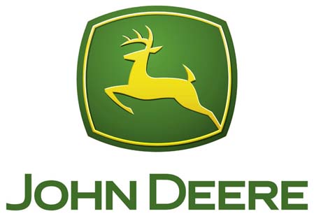
Another approach to logo design is simplicity. Taking a shape and simplifying it to its most basic form. One of my favorite examples of this, and one of my favorite logos of all time, is the John Deere mark. It's an obvious choice, a deer. But the superbly simplified shape of the leaping deer and the color choices make it an extremely strong brand.

Apple has taken a similar approach in recent years. The logo is an apple, but it is unmistakably Apple's apple.

Then you have wordmarks, or simply creating an interesting way of displaying the name of the business. Some of the most successful logos of all time are wordmarks: Coca-Cola, Disney, and Canon just to name a few.

Whatever approach you choose to take, I think the most important thing to remember when creating a brand is that the mark you create needs to be a representation of the organization for which it was created. It is the symbol by which the world will identify that organization. It has to be simple enough to be recognized easily in a split second, yet complex enough to evoke a meaning or a feeling to the viewer.
If I'm ever stumped on a logo project, I always end up looking to some of the great logo designers of the past, like Paul Rand, Saul Bass, Raymond Loewy, and Paula Scher, for inspiration.
Curtis Hale
CHIEF CREATIVE OFFICER

